
Watch: Creating your first VIEW_COMPONENT with Rails and Hotwire
Related videos
In this tutorial, I'm going to walk you through how to install and get started with View components in a Ruby on Rails application, using Hotwire and Tailwind CSS. Whether you're a beginner or an intermediate developer, this step-by-step guide will help you integrate View components seamlessly into your Rails app.
Installing ViewComponent
First things first, let's install ViewComponent in our Rails application. Open your terminal and type the following command:
bundle add view_component
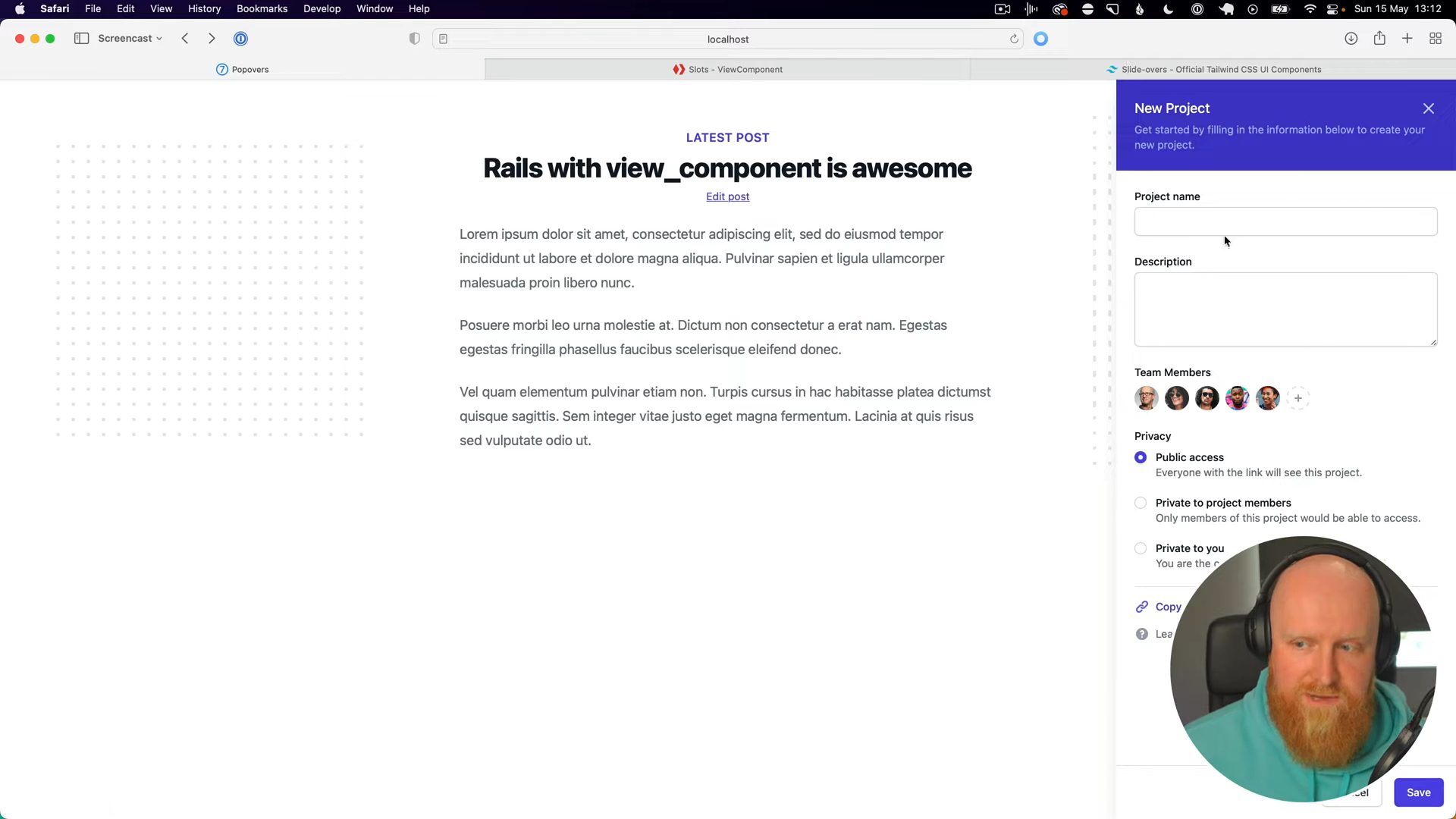
And that's it—ViewComponent is now installed. The app I've set up for this tutorial uses Tailwind CSS and serves as an example blog post app. We're going to demonstrate how to create a popover for editing a blog post.
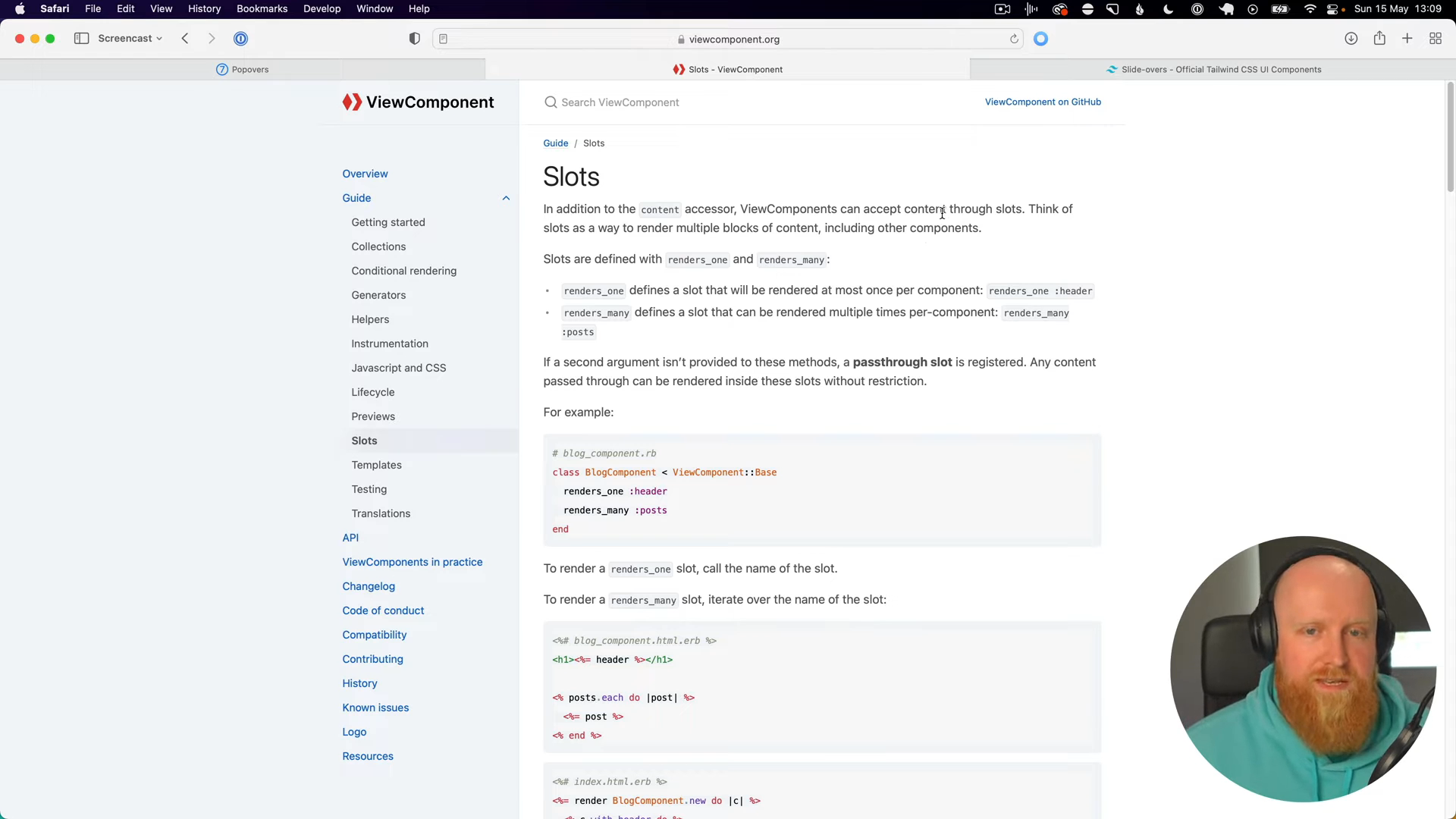
Here's what our Tailwind UI popover will look like. We'll convert this popover into a View component with sections for the header, content, and footer. To achieve this, we'll use slots in View components.
Configuring Tailwind CSS
To ensure Tailwind CSS works seamlessly with our View components, we need to update our Tailwind configuration. Add the following to your tailwind.config.js:
module.exports = {
  purge: ['./app/components/**/*.{html,erb,rb}',],
  // other Tailwind config...
}
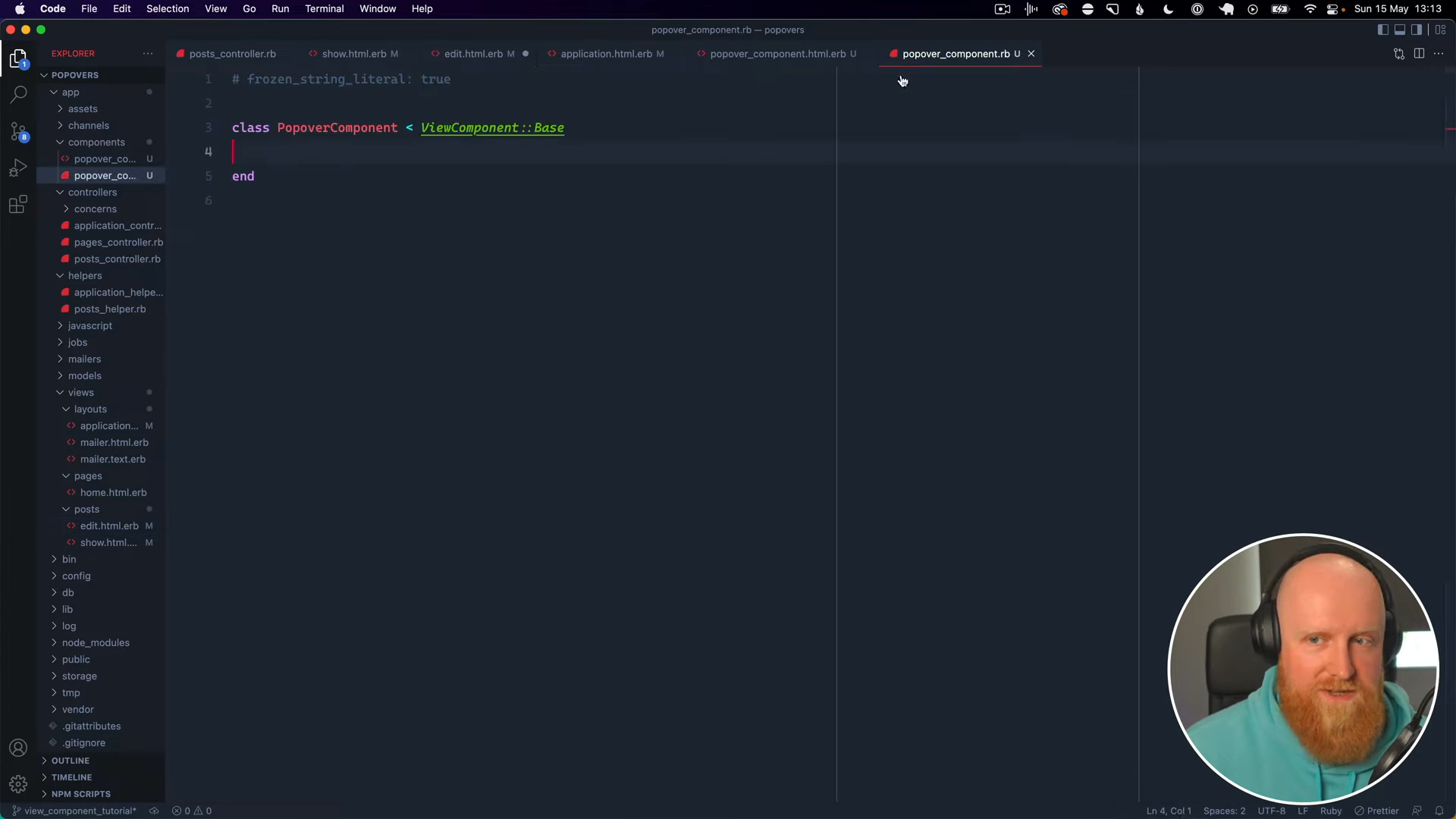
Creating the Popover Component
Now, we'll generate our first View component. Run the following command in your terminal:
rails generate component Popover
This command will generate two files: popover_component.rb and popover_component.html.erb.
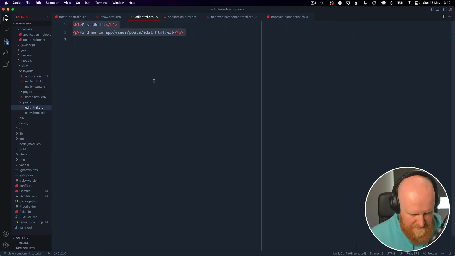
Creating the Turbo Frame
Let's dive into the code. We'll start by modifying our edit.html.erb to load the View component when editing a blog post. First, we'll add a Turbo frame tag:
<%= turbo_frame_tag :popover do %>
  <!-- Edit form code goes here -->
<% end %>
Turbo frames allow us to load content dynamically without redirecting to a new route.
For those new to Turbo frames, I recommend checking out my Hotwire Modals tutorial for a more detailed explanation.
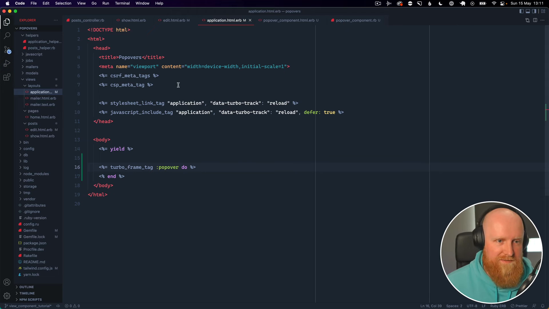
Next, update the application.html.erb layout to include the Turbo frame tags:
<body>
  <!-- Other layout content... -->
  <%= turbo_frame_tag "popover" %>
</body>
Now, let's update the edit link in our blog post show.html.erb view to use Turbo:
<%= link_to "Edit Post", edit_post_path(@post), data: { turbo_frame: "popover" } %>
Styling the Popover
If you refresh the page and click the edit link, you’ll see the edit form loading within the same page. Next, we'll style this form like our desired popover. Copy the HTML from your Tailwind UI template and paste it into the popover_component.html.erb file:
<div class="relative z-10" aria-labelledby="slide-over-title" role="dialog" aria-modal="true">
  <!-- Background backdrop, show/hide based on slide-over state. -->
  <div class="fixed inset-0"></div>

  <div class="fixed inset-0 overflow-hidden">
    <div class="absolute inset-0 overflow-hidden">
      <div class="pointer-events-none fixed inset-y-0 right-0 flex max-w-full pl-10 sm:pl-16">
        <!--
          Slide-over panel, show/hide based on slide-over state.

          Entering: "transform transition ease-in-out duration-500 sm:duration-700"
            From: "translate-x-full"
            To: "translate-x-0"
          Leaving: "transform transition ease-in-out duration-500 sm:duration-700"
            From: "translate-x-0"
            To: "translate-x-full"
        -->
        <div class="pointer-events-auto w-screen max-w-md">
          <form class="flex h-full flex-col divide-y divide-gray-200 bg-white shadow-xl">
            <div class="h-0 flex-1 overflow-y-auto">
              <div class="bg-indigo-700 py-6 px-4 sm:px-6">
                <div class="flex items-center justify-between">
                  <h2 class="text-lg font-medium text-white" id="slide-over-title"><%= title %></h2>
                  <div class="ml-3 flex h-7 items-center">
                    <button type="button" class="rounded-md bg-indigo-700 text-indigo-200 hover:text-white focus:outline-none focus:ring-2 focus:ring-white">
                      <span class="sr-only">Close panel</span>
                      <!-- Heroicon name: outline/x -->
                      <svg class="h-6 w-6" xmlns="http://www.w3.org/2000/svg" fill="none" viewBox="0 0 24 24" stroke-width="2" stroke="currentColor" aria-hidden="true">
                        <path stroke-linecap="round" stroke-linejoin="round" d="M6 18L18 6M6 6l12 12" />
                      </svg>
                    </button>
                  </div>
                </div>
              </div>
              <div class="flex flex-1 flex-col p-6 justify-between">
                <%= body %>
              </div>
            </div>
            <div class="flex flex-shrink-0 justify-end px-4 py-4">
              <%= footer %>
            </div>
          </form>
        </div>
      </div>
    </div>
  </div>
</div>
Using Slots in View Components
To make our component more modular, we’ll use slots for different sections like the header, content, and footer.
First, create an initializer in popover_component.rb:
class PopoverComponent < ViewComponent::Base
  attr_reader :title

  def initialize(title:)
    @title = title
  end
end
Update the popover_component.html.erb to make use of the title passed in:
<%# Simplified example %>
<div class="popover">
  <div class="header"><%= title %></div>
  <div class="content"><%= content %></div>
  <div class="footer"><%= footer %></div>
</div>
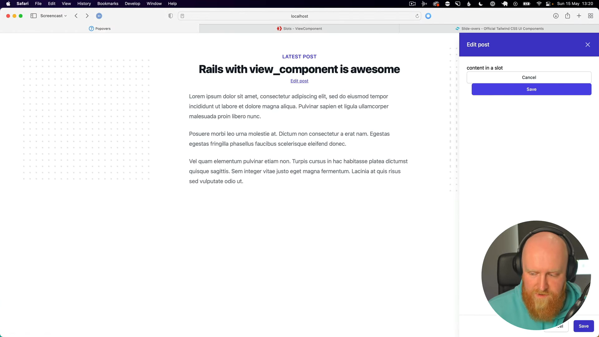
Initializing the Component in the View
Now, let's render this component in our edit.html.erb.
<%= turbo_frame_tag :popover do %>
  <%= render(PopoverComponent.new(title: "Edit post")) do |c| %>
    <%= c.body do %>
      content in a slot
    <% end %>

    <%= c.footer do %>
      <button type="button" class="rounded-md border border-gray-300 bg-white py-2 px-4 text-sm font-medium text-gray-700 shadow-sm hover:bg-gray-50 focus:outline-none focus:ring-2 focus:ring-indigo-500 focus:ring-offset-2">Cancel</button>
      <button type="submit" class="ml-4 inline-flex justify-center rounded-md border border-transparent bg-indigo-600 py-2 px-4 text-sm font-medium text-white shadow-sm hover:bg-indigo-700 focus:outline-none focus:ring-2 focus:ring-indigo-500 focus:ring-offset-2">Save post</button>
    <% end %>
  <% end %>
<% end %>
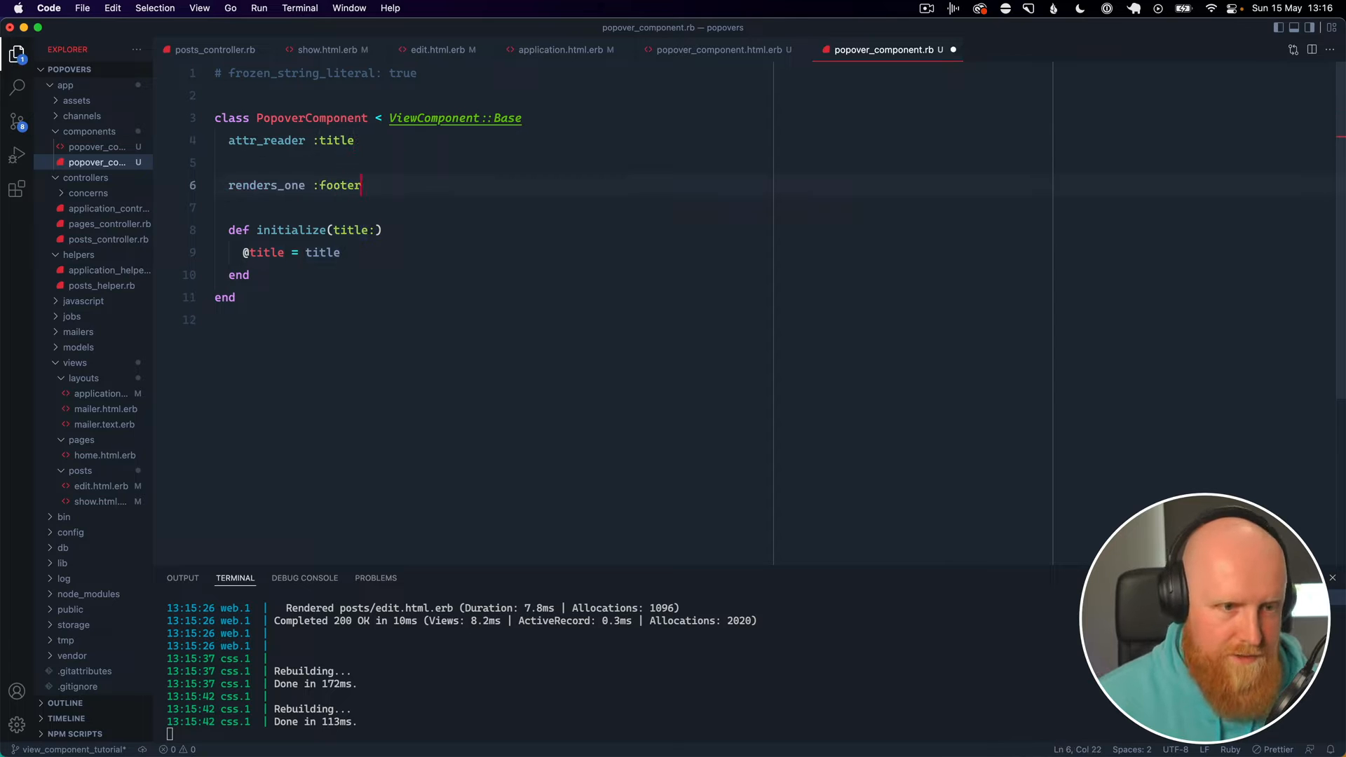
Handling Multiple Slots
We need to modify our component to handle multiple slots. Go back to popover_component.rb and add the following:
class PopoverComponent < ViewComponent::Base
  attr_reader :title

  renders_one :body
  renders_one :footer

  def initialize(title:)
    @title = title
  end
end
Finishing Touches
After setting this up, reload your page and click the edit link. You should see the content and footer rendered correctly within the popover.
For more advanced usage of ViewComponent and integrating it with Hotwire, be sure to check the Hotwire Modals video linked below.
If you followed all these steps, congratulations on successfully creating and integrating your first ViewComponent in a Rails application using Hotwire! If you enjoyed this tutorial and found it helpful, please subscribe for more content.